
Brush Up on Art Color Theory with These 3 Tips
Are you a thinking painter who wants to know more about the science of color? Here are three tips to brush up on art color theory.
Have you ever noticed that some colors just seem to work together and others…just don’t?
If you’ve spent any time with a paint brush and paints, you’ve noticed. It isn’t random or by accident that some paintings and designs catch your eye or produce a specific emotional response.
Different cultures have been using colors to evoke or invite specific feelings for thousands of years.
Understanding Art Color Theory can help you make smart choices for your work. Don’t guess or try and start from scratch!
Use the art color basics as your foundation and you can make more of an impact with your artwork. Check out these tips to brush up on your Art Color Theory basics:
Create a Context
A color context creates a predictable response or perception based on the colors used. That sounds complicated.
It’s not.
Think about how moonlight is almost always created in movies or plays. It’s blue. There’s nothing about actual moonlight that is blue.
Real moonlight is just the sun reflecting off the surface of the white/gray moon. But we perceive it as blue, so that is how it is presented.
Thinking about the context of your color choices in contrast to the colors around them will help you make more intentional choices.
Use the Art Color Wheel
Remember that big poster on the wall of your kindergarten art room with all the bright colors on it? That’s the color wheel! It’s kind of important.
All colors can be made from the three primary colors: Red, Blue, Yellow.
When these colors are mixed they make the complimentary colors: Orange, Purple, and Green.
Tertiary colors are created when you mixed a primary color with a secondary (or complimentary) color.
Getting familiar with the relationships between colors on the color wheel will help your color combinations be purposeful and effective.
Consider Temperature
No, not the literal temperature of your paint. There are many different types of paint that all require different care strategies, but most paint is fine at room temperature.
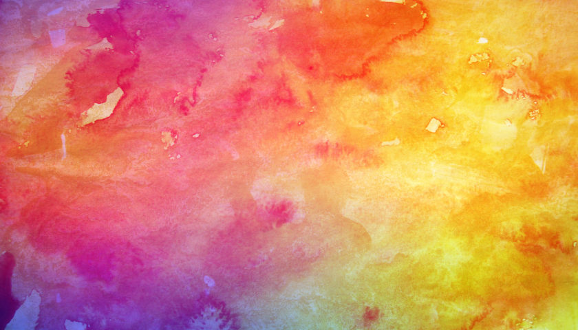
Art colors fall into two categories: warm or cool. Warm colors include red, orange, yellow. Cool colors are blue, green, purple.
Warm colors often seem to jump out at or come toward the viewer. Cool colors tend to blend, reflect or rest further back on the painting.
Deciding between using a warm or cool palette can change the entire mood or feeling of your artwork.
There are other ways to affect the mood, feeling, or meaning of your painting beside just considering the color. There are different additives that can make paint appear metallic or even glow-in-the-dark.
But thinking about Art Color Theory when you make your color choices will make it much easier to communicate clearly through your artwork.
Don’t over think it, but be aware!
Colors aren’t simply the building blocks of your painting or design. Color communicates. Who doesn’t want to be a better artistic communicator?
Use the basics, like the art color wheel, and your make combinations will start to make much more sense.
