

In this article I am to to explain how to use the Zorn palette in your paintings. This limited palette has gained a lot of popularity in the last few years. It is amazing to see how beautiful and cohesive paintings can be when you only use four colors.

One of the biggest benefits of only using four colors is that is very easy to achieve color harmonies. As these colors (really only two actual colors if you think about it) are often harmonious in all kinds of ratios and combinations. The wide variety of skin tones that can be made with just these four colors eliminates the need for adding other pigments that could clash with the base four.
Who is Anders Zorn?
Anders Zorn was a Swedish artist that lived between 1860 and 1920. He is widely seen as one of the most famous artists to have ever come out of Sweden. He is most well known for his portraits and figurative work. Many prominent people sat for his portraits, this included royalty and three American presidents. Part of what is so amazing about his work is that he used an extremely limited number of colors. With only four colors he was achieve a wide range of shades and amazing warm and cool color contrasts. His palette was particularly suited to painting figurative works. Today his palette has received renewed interest from many artist who paint figurative and realistically.
What is the Zorn palette?
The Zorn palette is made up of only four colors:
- Red
- Yellow
- Black
- White
Using these four colors, you can mix a very wide range of colors. It is easy to make orange or make brown paint as well as a huge range of other colors. A surprisingly wide range of flesh tones can be made. Despite the fact that there is no blue paint you can make grey appear blue by using optical contrasts. This means by placing a very warm orange hue next to grey, the grey will appear to be a cooler blue. Green can also be made by mixing black and yellow. One of the reasons that this is such a great palette for painting figurative images is that it tends to be quite warm. Without a true blue, flesh tones have a very warm overall feeling.
You can use several different base colors in this type of system. Here are some of the most common.
Red: Vermilion, Pyrrole Red, or Cadmium Red Medium
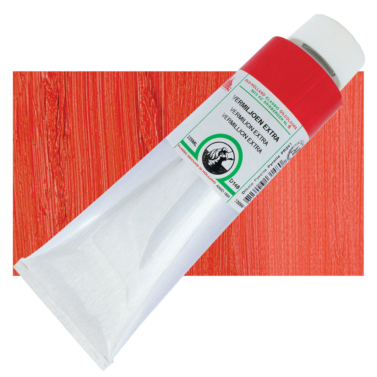
Old Holland Classic Oil Colors – $223.88
from: Blick Art Materials
While Zorn probably used true red vermilion, it is very hard to find today. It is made from a highly toxic mercury containing mineral called cinnabar. The good news is almost every manufacturer today makes a vermilion hue. These are usually made from pyrolle pigments or other modern pigments. Cadmium red medium is also a suitable substitute.
Yellow Ochre
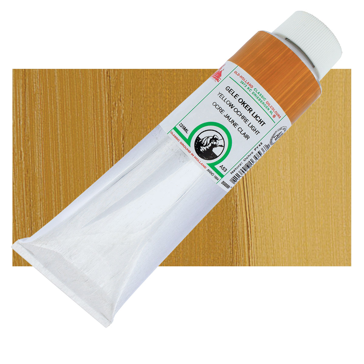
Old Holland Classic Oil Colors – $61.46
from: Blick Art Materials
One of the most historically used pigments, Yellow ochre is made from iron-oxide. This earth tone has been used by artists for thousands of years. It has a slightly brownish tint to it.
Mars Black or Ivory Black
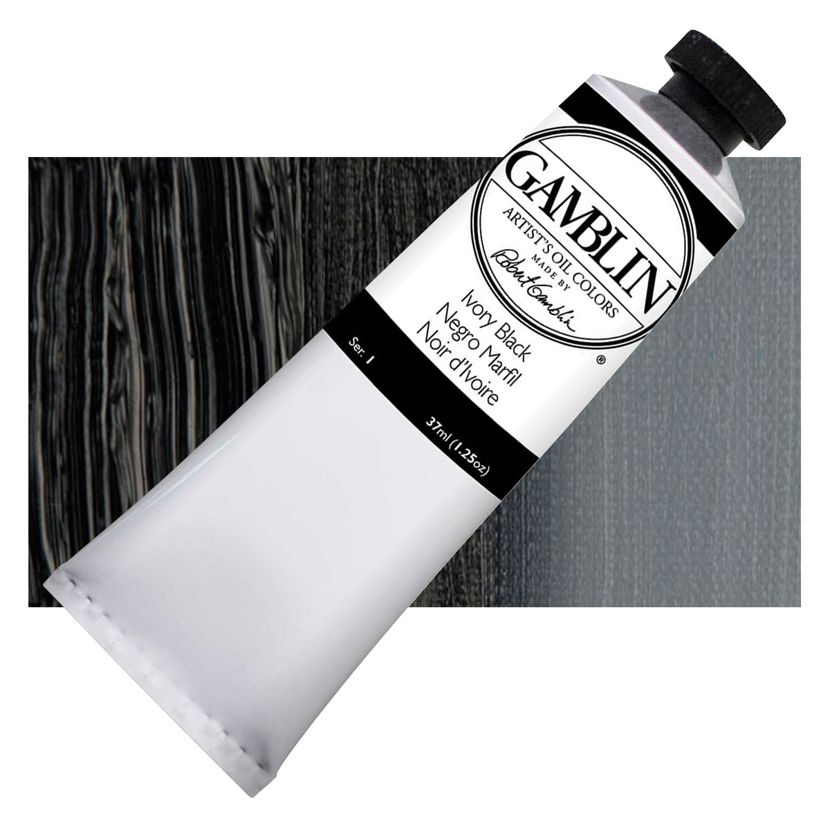
Gamblin Artist’s Oil Colors – $8.25
from: Blick Art Materials
Different manufacturers call their blacks different names. What you want is a cool black. This is because there is no blue in this palette, so the black will be standing in as the coolest color. The cooler the black, the easier it will be to make blueish grey and green shades.
Titanium White, Cremnitz White or Lead White
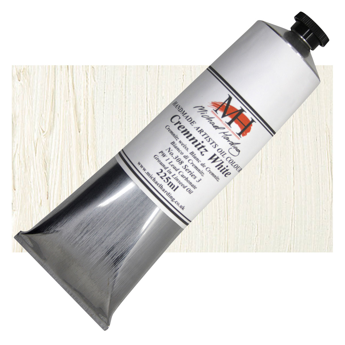
Michael Harding Artists Oil Colours – $113.61
from: Blick Art Materials
Lead white was the default white pigment used by artists in Zorn’s era. Many oil painters today still love it. Lead white has a certain radiance that can’t be achieved with modern alternatives. The problem is that lead is extremely toxic, so if you choose to use it you need to take the proper safety precautions this includes gloves.
I prefer to use titanium white because it is much more common and safer. One thing to keep in mind is that titanium white has almost 10 times the tinting power of lead white. So many artists choose to cut it 1:10 with a neutral medium to simulate lead white tint strength. Tad Spurgeon has an excellent book and several recipes on his his site that explain how to make a neutral putty medium for oil painting.
The Zorn palette proved to be quite influential to many artists. Odd Nerdrum is believed to use a very similar limited palette in his epic figurative works. Also many artist in the realism revival movement use a limited palette that is likely influenced by Zorn.
Did Zorn Palette ever include any other colors?
Despite common belief, Anders Zorn did actually use a couple of other colors during his career. While the standard Zorn palette is perfect for most of his interior portraits, there were times when other colors were needed. There is evidence the Zorn used a green and a blue in addition to the basic Zorn palette. These would have been useful for outdoor scenes where a green made from black and ochre wouldn’t be able to capture the intensity of the scene. Also things like skies and water can be made much more vivid when a blue is used instead of just blacks and grey. Another instance where Zorn would use blue and green, is if his subjects were actually wearing clothing that was in a more vivid hue. As you can see in his self portrait above, the bright green vest is most like made with a supplementary blue or green.
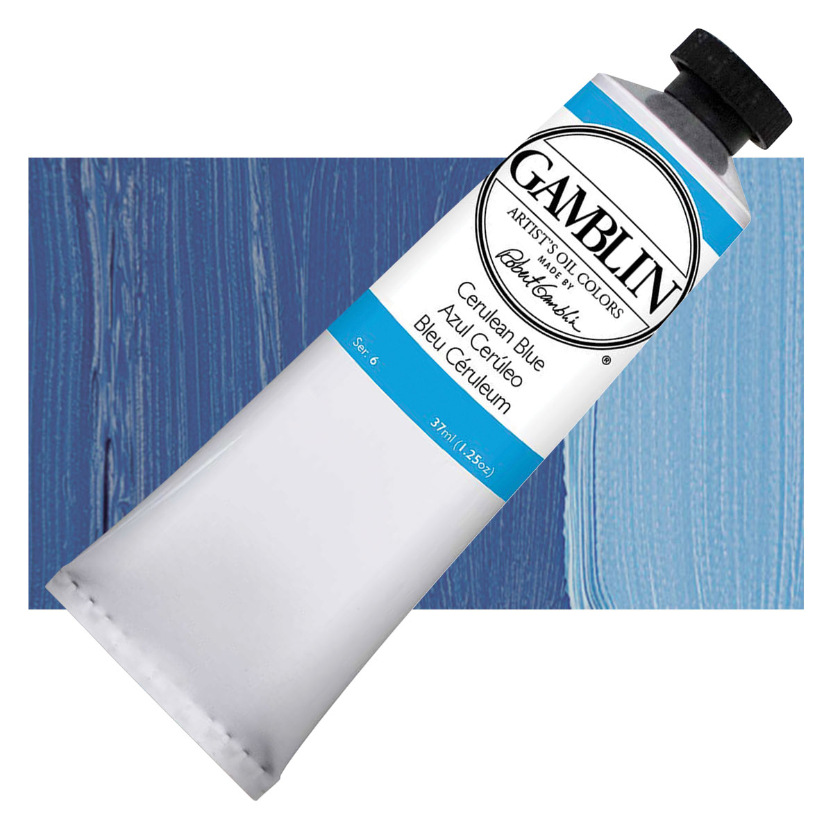
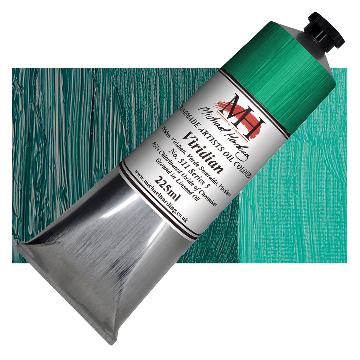
It is commonly believed that cerulean blue and viridian green were at least occasionally used by Zorn. These two colors can be used very effectively to supplement the standard Zorn palette.
Cerulean Blue
Gamblin Artist’s Oil Colors – $27.00
from: Blick Art Materials
Cerulean blue has been used by artists as a sky blue for many years. In fact the word Cerulean derives from the latin word for heaven or sky.
Viridian Green
Michael Harding Artists Oil Colours – $202.39
from: Blick Art Materials
A beautiful blueish green made from chromium oxide pigment. This shade of green is a perfect compliment to the warm reds and yellows used in the Zorn palette.
Using the Zorn Palette with acrylic paint
Golden Heavy Body Artist Acrylics and Sets – $77.06
from: Blick Art Materials
You can absolutely use the Zorn palette with other types of paint besides oil paint. Acrylics would be a great option and I actually do use this palette quite a bit on the under-layers of my acrylic paintings. The principals of color mixing and contrast can be transferred to all kinds of mediums. Acrylic, water colors, even oil pastels can use a Zorn palette to great effect.
I spent about a year using the Zorn palette almost exclusively in my paintings. I found that by limiting the number of colors on the palette my skill at mixing improved significantly. I also learnt a lot about using optical temperature contrasts on my paintings. This means that I could make a grey shade appear more blue by contrasting with a more warm orange shade. These are both very useful skills and I found they really helped me when I re-introduced a more extensive palette.
