
In this guide we will examine 42 different ways to make orange paint. So if you have ever wanted to know what colors make orange, read on. Orange is a great color that is generally warm and vibrant. As we will examine in the article there is a tremendous range of oranges. Orange can even being to take on hints of pink, peach, and brown which is useful if your are painting the highlights or shadows of an orange object. For example if your were painting a fall scene with orange leaves, the shadows underneath the leaf might be closer to brown and the highlights on top might be closer to pink. It is very useful as an artist to explore the full range of color possibilities.
What colors make orange?
On the color wheel, orange fits in between red and yellow. It is mixed by combining a yellow and a red pigment. There are also several pigments like cadmium and several earth colors that can come in a naturally occurring orange form.

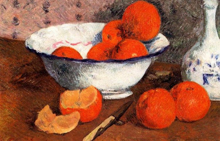
Paul Gauguin, 1881, Musée des Beaux-Arts de Rennes, Rennes, France.
There are several types of paintings that would feature orange. Obviously if you are painting actually oranges it would be a great start. Other fruits like peaches, mangoes, and even apples can feature orange. Fall scenes like harvested fields, and trees with warm colored leaves all prominently feature orange. Believe it or not, the right orange can really bring a figure painting to light. The right hue in small amounts can add a dimension of warmth and radiance to flesh tones. Sunrises and sunsets can also have a ton of orange shades in them. Another great place to use orange is on a canvas that has some blue in it. We will examine the science behind why this a good idea a little later on in the article.
Primary, Secondary, and Tertiary Colors

If you look at a color wheel you will see the three primary colors: red, yellow, and blue. The are spaced out evenly along the wheel as if they are in a triangle. Between each of them are the secondary colors. These are formed if you were to mix two primary colors that are beside each other. Red and yellow mix to make orange. Yellow and blue mix to make green. Red and blue mix to make purple.
Finally you have the tertiary colors. These are similar to the secondary colors in that they are mixes of the primaries. The difference is that they skew more towards one primary then another. So you can imagine that a medium orange would be a secondary color. A reddish orange (grapefruite) or a yellowish orange (school bus) would be considered tertiary colors.
Warm and Cool Colors and making orange
There is a couple of different ways of thinking about warm and cool colors. The easiest is to think of blue, green, and purple as the cool colors, and red, yellow, and orange as warm colors. Essentially the two primary colors next to orange (yellow and red) are warm. The two secondary colors (green and purple) next to blue are cool. Cool colors give a soothing and relaxing effect, and warm colors give a vibrant, energizing effect. Although most artist when use both warm and cool colors in the same painting.
A more advanced way of looking at warm and cool colors, is by examining whether a color tends towards being red or blue. For example you can have a warm yellow like cadmium yellow medium that has hints of reddish orange in it. You can also have a cool yellow like hansa yellow light that has hints of greenish blue. If you pick any primary, secondary, or tertiary color tube you should be able to see whether it tends to be cooler or warmer by laying it next to a similar color. Keep in mind that in a painting, warm and cool is relative to the colors around it.
It is useful to artists to be familiar with warm and cool colors, and even build a warm and cool palette. This means that they have a warm and a cool version of each of the primary colors. In a painting warm colors tend to come forward and cool colors tend to receded. This is very useful to know if you are trying to create a realistic three dimensional space. By placing warm colors in the foreground and cool colors in the background you can really enhance the sense of depth of a painting.
Browns, Pinks, and Peaches. Are they mixed orange?
One thing that is interesting when you mix oranges is that most tubed paints are not purely made from primary colors. Many of them contain brownish shades, white, black, and gray. That means when you are examining how to mix orange paint, you will come up with all kinds of different shades. But this is nothing to be a afraid of. Pink, peach, and brownish oranges can be some of the most rich and beautiful colors that you can mix.
It is also worth noting that if you mix a cool red and a warm yellow (or vice versa) you will get a different range of oranges. This is because the blueish tint of the cool color will mix with the orange to mute it slightly and make a brownish shade. So if you want a really “hot” orange then stick to mixing warm yellows and reds like pyrrole or cadmiums. So if you want to learn how to make orange, you will also be able to make many other similar hues.
What is the brightest orange paint?
In my experience the brightest orange paint that I have found is Cadmium Orange. Golden Heavy Body Cadmium Orange is very vibrant and can be mixed with a small amount of cadmium yellow to make it pop even more. In my experience, this tubed color will give you a brighter orange than anything you can mix.
This is because it contains only the PO 20 cadmium orange pigment, which is very bright. You lose some of the optical brightness when you begin to mix a yellow and red together. Cadmium orange and Pyrrole orange are available in acrylics, oils, and watercolors by a range of paint manufacturers.

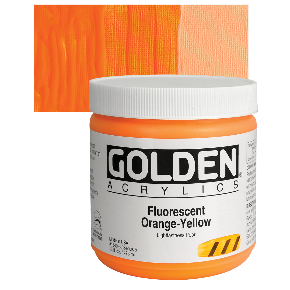
Another possibility if you are after the absolute brightest color is to use a fluorescent orange paint. Golden Fluorescent Orange-Yellow paint uses special fluorescent pigment that makes the orange appear brighter than is possible with conventional pigment. These polymer coated dies are incredibly transparent. The best way to use it would be to layer the fluorescent orange on top of another orange color. Golden makes great products and this is no exception.
Golden Heavy Body Artist Acrylics and Sets – $47.94
from: Blick Art Materials
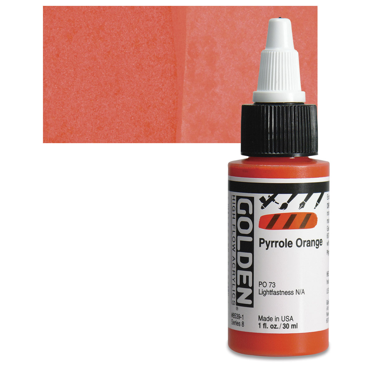
If you are concerned about using cadmium pigments then there is another very bright orange from Golden Paints. Pyrrole Orange comes in several of the golden ranges. Pyrrole orange also uses only one pigment which helps to make it optically brighter then a mix.
Golden High Flow Acrylics and Sets – $7.76
from: Blick Art Materials
Simultaneous Contrast for the brightest possible orange
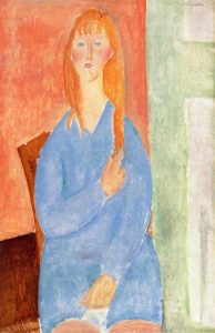
Amedeo Modigliani. Private Collection
There are several tricks that artists can use to make their orange seem even brighter. By harnessing the power of the red and green cones in our eyes we can amplify the intensity of one or more colors. Simultaneous contrast occurs when you place a color on the color wheel next to its complimentary color. The complimentary color is the color directly across from it on the color wheel. So in the case of orange, you would place blue next to it. When our eyes focus on something blue they create an after image of the complimentary color. This is the appearance of the complimentary color even when it isn’t there. By using this phenomenon, an orange and a blue placed next to each other will both look more vibrant then if they were on their own. Amedeo Modigliani does an amazing job of this in his painting Girl in Blue. You can see how he uses orange and blue in simultaneous contrast to make them both appear very vibrant.
How to mix orange paint
I wanted to see how to mix the best orange. So I combined seven different reds and seven different yellows to see what kind of shades of orange I would come up with. The results were actually quite remarkable as I ended up with 42 different shades of orange. As you will see shortly, they range from bright and vibrant, to brownish, to almost pink in appearance.
What colors make orange: The base colors I used
I used several of my favorite reds and yellows. These included both vibrant pure colors and more muted earth tones like siennas and umbers. You could easily replicate this experiment at home with the colors you have available to see what kinds of orange combinations that you can come up with.
Yellows
These are the yellows that I used to create my oranges. These are only a few of the available yellows. There are many more like Hansa yellow that could give you interesting results
Yellow Ochre
A cool earthy brownish yellow. It is an earth pigment primarily made from iron oxide, clay, and sand.
Raw Sienna
A cool yellowish brown. Also an earth pigment that is primarily made from iron oxide and manganese oxide.
Cadmium Yellow Light
A rich, very bright, pure yellow made from cadmium pigments. This is one of the brightest colors that I have used.
Cadmium Yellow Medium
Similar to cadmium yellow light, except it is slightly warmer and a tad less vibrant.
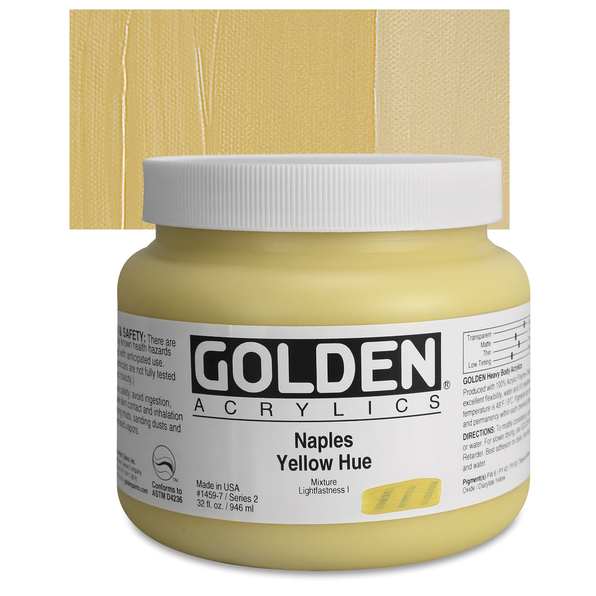
Naples Yellow Hue
A warm reddish yellow with an opaque white component. It is made from Titanium, Iron Oxide, and Diarylide. It was originally made from lead and was quite popular with the old masters. This version was created as a safer alternative. The high content of white in this yellow will give some interesting results.
Golden Heavy Body Artist Acrylics and Sets – $64.32
from: Blick Art Materials
Transparent Yellow Iron Oxide
A rich, warm and very transparent brownish yellow. Normally great for creating rich and warm glazes.
Reds
The reds I used also range from pure cadmium colors to more brownish earth tones.
Cadmium Red Light
This is a very vibrant cadmium based paints. Probably the brightest red that I have used, it actually is on the cusp of being an orange-tinted red.
Cadmium Red Medium
Another rich vibrant color. This is more a pure, bright, fire engine red. You could also use Pyrrole red as a substitute which is a non-cadmium alternative.
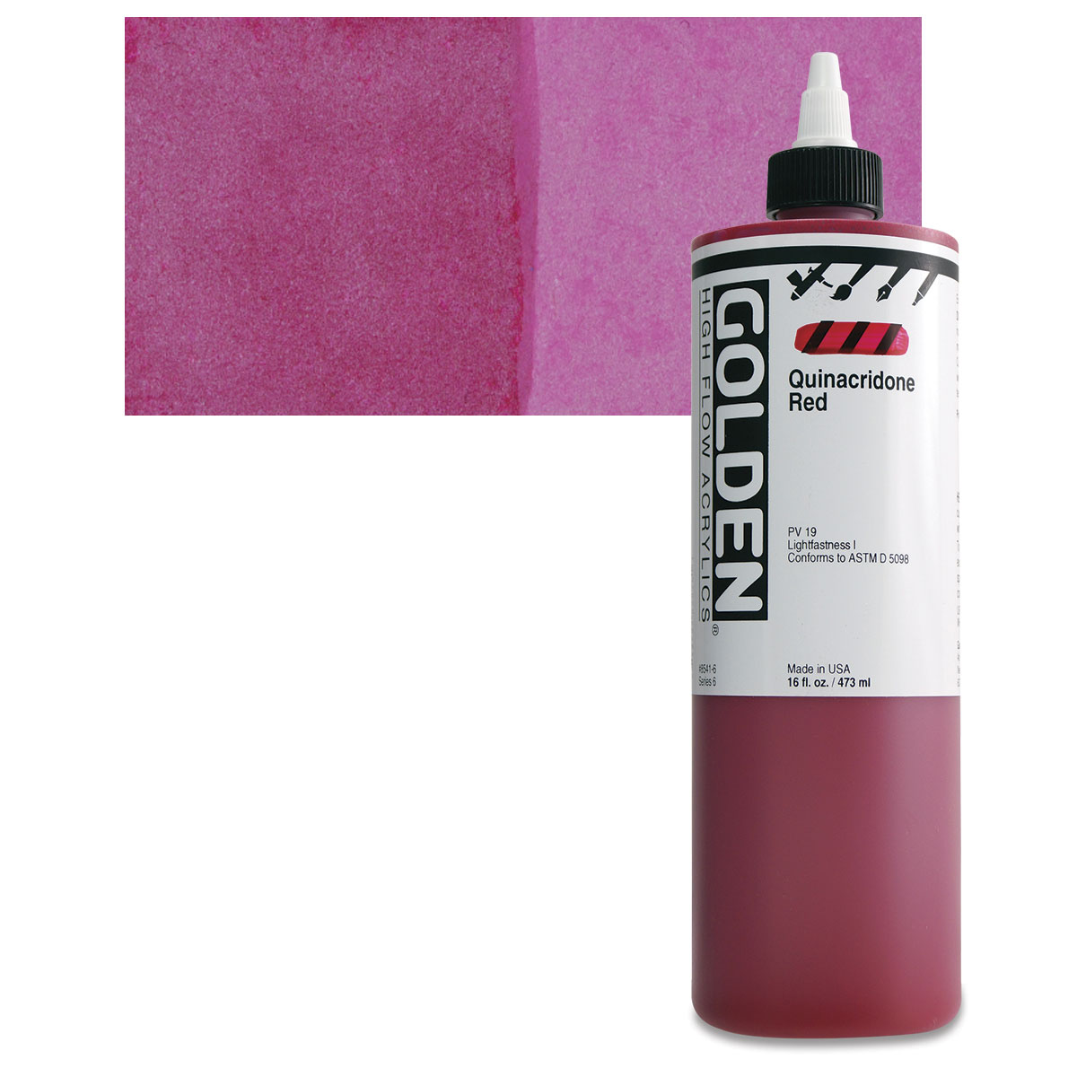
Quinacridone Red
A cooler, transparent red. Almost has a pinkish hue. This color is pretty transparent and makes glazes that are very vivid. I also use it mixed with white to make beautiful and cool pinks.
Golden High Flow Acrylics and Sets – $54.45
from: Blick Art Materials
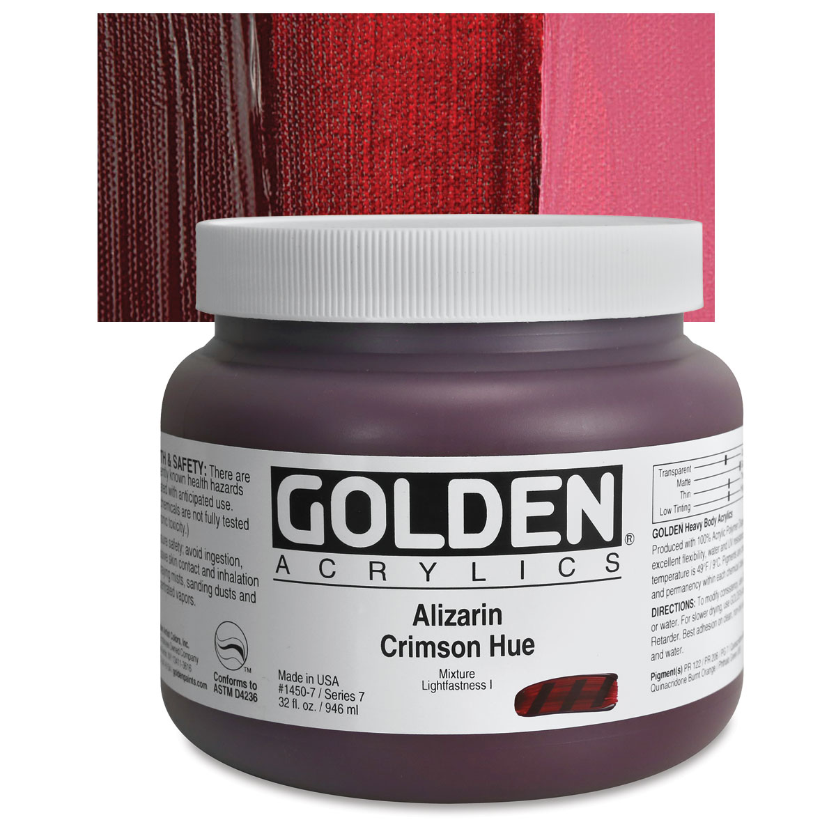
Alizarin Crimson Hue
A modern mix of quinacridone and phthalo makes a vibrant cool reddish brown.
Golden Heavy Body Artist Acrylics and Sets – $111.22
from: Blick Art Materials
Red Oxide
This is one of the oldest pigments ever used by humans. It is made from iron oxide. It is a rich reddish brown also known as Venetian Red by some manufacturers.
Burnt Sienna
The same composition as the raw sienna that I used in the yellow section, but it is heated to change the pigment to a reddish brown.
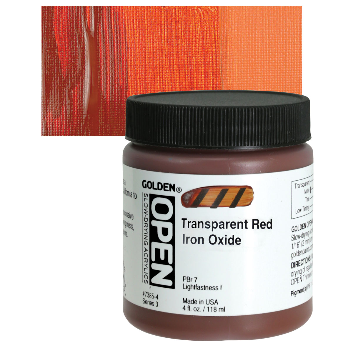
Transparent Red Iron Oxide
Another iron oxide pigment that gives a rich reddish brown that is great for glazing.
Golden Open Acrylics and Sets – $13.01
from: Blick Art Materials
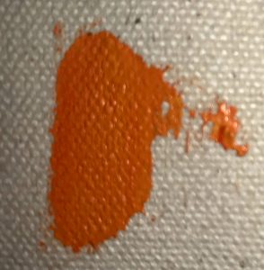
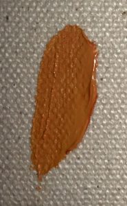
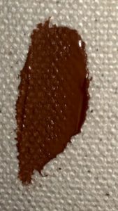
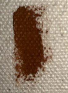
How to make orange: The process
I mixed each of the colors above with a palette knife and applied them to raw canvas on the following chart. I did not use set ratios of red and yellow to make orange. This is because each color has very different tinting strengths. Instead I adjusted the ratios for each combination to get a medium orange. This means an orange that would be as close as possible to the middle of red and yellow on a color wheel.

The results: 42 different ways to mix orange paint
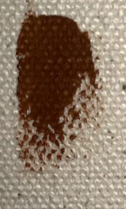
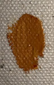
Below are the swatches of color of each orange. I have also included my notes for each mix.

A rich warm brownish orange. The ocher subdues the vibrant cadmium red quite a bit.

Super rich. The transparent yellow darkens it a bit. Would be good for shadows.

This is getting into a peach flesh tone hue. This is because there is so much white in the naples yellow that it is almost like mixing a pink.
This is a bold classic orange. It is the brightest orange that I mixed. This is the color you initially think of when you think “orange”. You could adjust the ratio of yellow and red for some incredible variations.

Nice bright red. The slight coolness of the cadmium yellow light, mutes it just a bit.

This is really more of a reddish brown. But a nice rust color none the less. Sienna is already pretty brown and doesn’t have enough power to overcome the cadmium red.

Another beautiful rusty brown.

This is a really interesting creamy peach color. Could be used for warm shadows on a portrait.

A very warm classic orange. Probably the “warmest” of all of the colors that i mixed. Great color for the brightest areas of a painting. My mix here is a little skewed towards yellow so a bit more red could be added.
Another rich orange. Any combination of a cadmium red and a cadmium yellow will make a pretty vibrant classic orange.

I rusty brown. I almost see a purplish tinge to this color.

A warm amber color. Would be a good shadow contrast to a more vibrant highlight orange.

The coolness of the red created an interesting orange brown.

Similar to above, but with an even cooler tone because of the raw sienna.

This one is pretty surprising. The warmth of the cadmium yellow “warmed up” the quinacridone red to make a very rich color. A great way to mix orange paint.

Same as above. The warmth of the cadmium really influences the overall orange shade.

This one actually just made a pink. The amount of yellow in the Naples hue wasn’t enough to balance out the quinacridone red. I could try using more of the yellow.

This is actually one of my favorite colors for glazing. A very warm transparent brown.

Interesting combination. It is funny how many of these mixes start looking very similar even though they are using totally different pigments.
Same as above, just a bit cooler. This seems to be a pretty common pattern. Raw sienna and yellow ocher are pretty close, with the former being just a hint cooler. It isn’t that surprising that every swatch using these two colors looks very similar.

A yellowish brown. This orange swatch almost looks like yellow ocher in its tube form.

An interesting and rich color made by combining a very transparent pigment with a very opaque one.

This is definitely in the realm of pink and peach. has a cool hue, could be used for flesh tones.

This would be a rich glazing orange brown.

This would be another great orange shadow color. Would be good on leaves or the shadow of a fruit.

A some point, some of these colors no longer look like oranges. This one still has enough warmth to maybe qualify?

I nice vibrant amber color. The earthy red oxide balances out the intensity of the cadmium yellow.

Very similar to the color above, but maybe just a tiny bit cooler.

This is a nice reddish orange-brown that would be good for shadows.

A very earthy opaque orange brown.
This just appears brown to me, but a warm brown.
Same as above but a little cooler. This is probably the most “brown” color that I mixed. If you are looking up how to mix brown, this would be a good solution.

The burnt sienna cools the heat from the cadmium yellow quite nicely.

Same as above just a little bit warmer and more of an orange tint.

This is a beige brown, there is really little classic orange in it. But it could be useful in the shadow areas of an orange object.

This is a nice dark orange mix.

Another warm orange brown that would almost be a good flesh tone. I really like naples yellow as a base for flesh tones, and many of the reds that I have mixed it with have made great combinations.

A very warm mustard orange.
This color reminds me of fall leaves. It has a unique warmth to it.

Always interesting results when mixing a transparent color with a more opaque one. It kind of makes me curious what it would look like if the iron oxide red was glazed over the raw sienna.

Another earthy combination that looks very similar to the other amber browns.

This would be a really great glazing color. Very rich and warm.
Tubed Orange Colors
There are also a wide variety of tubed orange paints. These are bright and rich colors that you don’t even need to mix for the perfect orange. You can also mix them with any of the above colors for an even wider range of choices.
Old Holland Brilliant Yellow
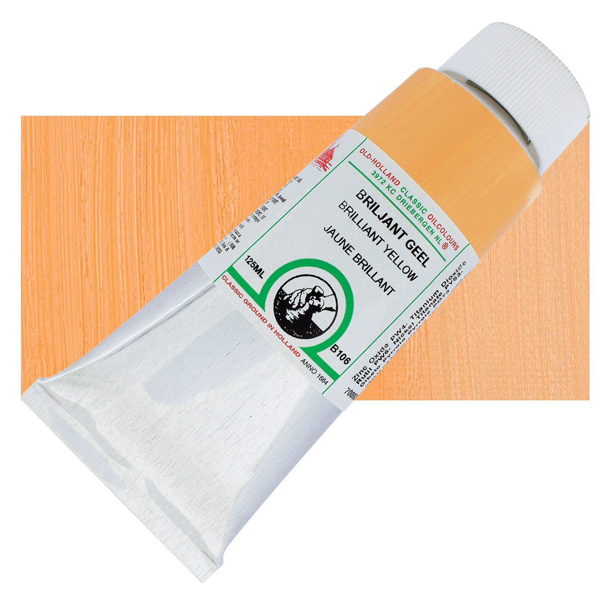
Old Holland Classic Oil Colors – $59.33
from: Blick Art Materials
While this is labeled as a yellow, it is really on the cusp of being an orange. A beautiful, warm yellow-orange oil paint.
Michael Harding Indian Yellow Red Shade
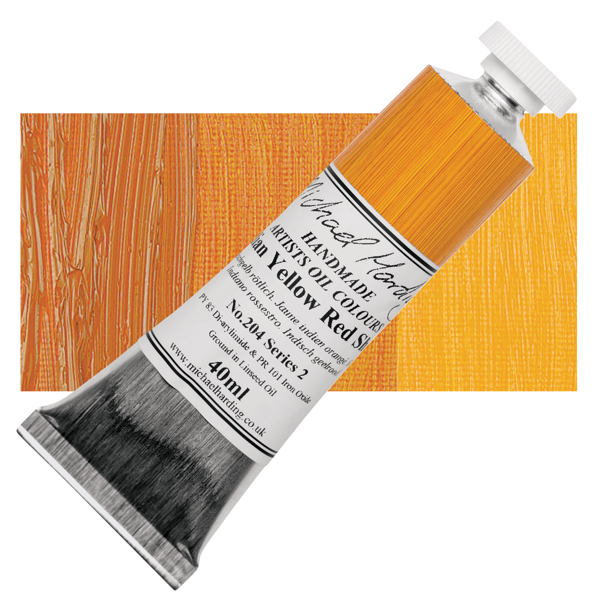
Michael Harding Artists Oil Colours – $16.92
from: Blick Art Materials
Another tubed paint that is labeled as yellow but has a lot of orange characteristic. Michael Harding makes some of the highest quality oil paints available. They are incredible to use. Believe it or not, indian yellow was originally colored from the urine of cows that ate mango leaves! Thankfully this is not longer the case, but the rich warm yellow orange hue continues to live on.
Winsor & Newton Professional Water Color Cadmium Orange

Winsor & Newton Professional Watercolor Tubes and Sets – $8.82
from: Blick Art Materials
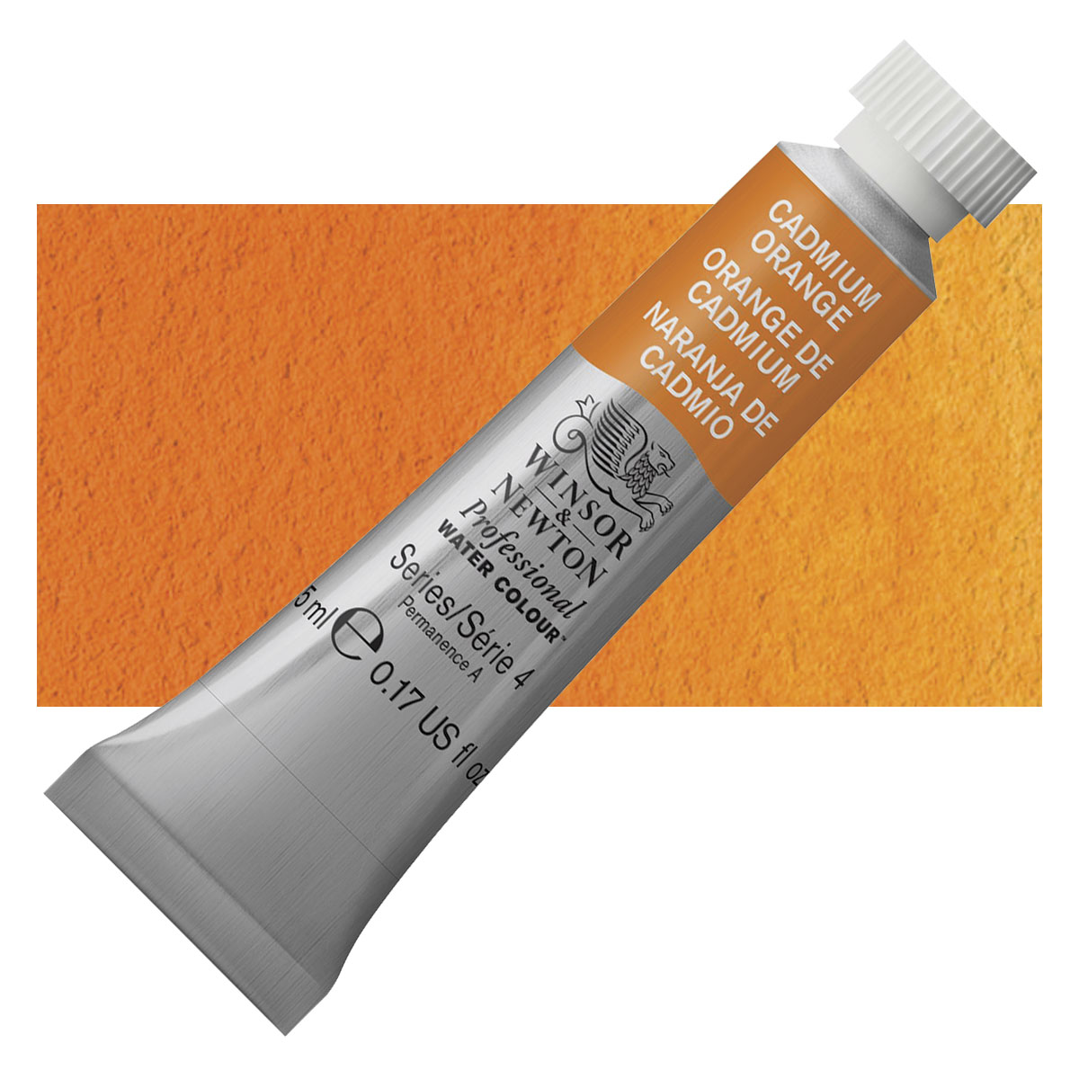
Cadmium orange whether it is in Acrylics, Oil, or Watercolor is probably the brightest orange that you will be able to get without moving to fluorescent paint. I have found that mixing cadmium orange with a little bit of cadmium yellow medium makes it even more vibrant.
Golden Quinacridone / Nickel Azo Gold
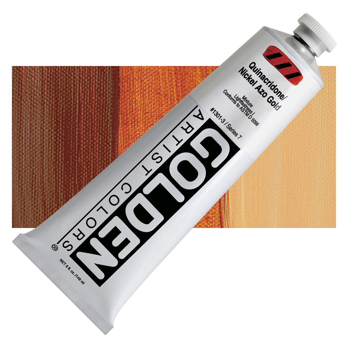
Golden Heavy Body Artist Acrylics and Sets – $25.89
from: Blick Art Materials
Quinadrone Gold is a rich brownish orange. It is actually one of my favorite colors and it truly radiates warmth. It would be great for warm shadow areas.
A wider range of ways to mix orange paint
I have mixed 42 different hues of orange for you to see. If you want to push this range even further and you could adjust the ratios of yellow to red in each mix. I tried to mix each one to get a medium orange. But, you could add more yellow or red to each one to explore a range of tertiary colors. You could also try adding 3 or more of the above colors together for a super wide range of possibilities. As with all primary and secondary colors you also have the option of adding black, white, or gray to the above mixes. This will give you darker, lighter, or more muted oranges depending on the effect that you are going for.
Conclusion
Orange is a beautiful secondary color formed by mixing a yellow and a red pigment. There are also paints that have a natural orange hue that can be a useful addition to your palette. Remember you aren’t just limited to bright orange. If you look at something that is orange in real life you will see the wide range of hues and shade that this wonderful color can take.

Comments are closed.